A complete label redesign for Old Town Brewery's two core products, Drunken Swan (Pilsner) and Thirsty Fish (IPA).
The goal was to elevate both labels into a cohesive visual system with strong shelf presence while preserving the playful personality already built into each beer's name.
Project info:

The existing labels relied on generic, internet-sourced illustrations and inconsistent typography, resulting in a brand perception that felt unrefined and easy to overlook. On a competitive shelf, first impressions are everything — and the labels weren't doing the product justice.
Problem:
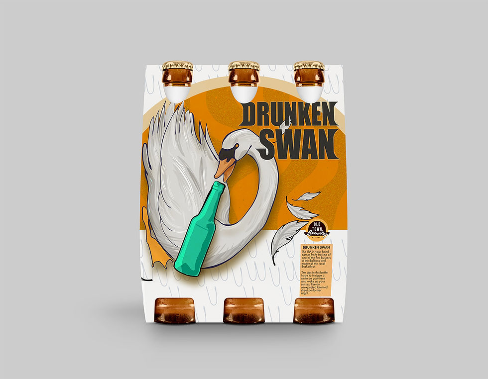
Bold, custom illustrations were developed specifically for each product, replacing generic imagery with visuals that could only belong to Old Town Brewery. Each label maintains its own character while sitting within the same visual system.
Thirsty Fish leads with a dynamic, fluid composition and vibrant teal tones that reflect its bold, hoppy profile. Drunken Swan takes a cleaner, more playfully dramatic approach with warm amber hues nodding to the crisp, golden nature of a pilsner. Structured typography anchors both labels and ties the system together.
Design Intent:

Insight:
Drunken Swan and Thirsty Fish already had personality. The design didn't need to invent a story; it needed to tell the one that was already there. Custom illustration was the key to making that personality ownable and impossible to replicate.
Outcome:
The result is a cohesive, shelf-ready identity that transforms two products from forgettable to distinctive, giving Old Town Brewery visuals that finally match the character of what's inside the bottle.




Before
After
Label Design
Website Design
Illustration
Typography
Packaging Design
Graphic Design